NEWS
07.04.2022
The Story Behind the Deep Red Cover of the Dragon Ball Complete Edition | Interview with Book Designer Hideaki Shimada
The final chapter of Dragon Ball was published in Weekly Shonen Jump in 1995, and it was 7 years later in December of 2002 when the 34-volume Dragon Ball Complete Edition went to print. The complete edition books sported covers that were a sharp departure from the standard white and blue of the 42-volume Jump Comics version, instead featuring a dashing, monotone red background, and went on to become bestsellers in the Japanese market.
The mind behind the striking complete edition covers was book designer Hideaki Shimada, who has also worked on the covers for the Slam Dunk Complete Edition (Takehiko Inoue), Blue Exorcist (Kazue Kato), Tokyo Ghoul (Sui Ishida), SPY×FAMILY (Tatsuya Endo), and many others. Hideaki's work has adorned an impressive number of bestselling titles over the years, even when just taking into account the Shueisha properties he's worked on, and his accomplishments to date have solidified him as a legend in the industry of manga design.
In fact, he even designed the logo for Weekly Shonen Jump over 20 years ago—the same logo that appears on the magazine's cover to this day.
For this article, we interviewed Hideaki about how his meeting with Akira Toriyama led to the blazing red cover of the Dragon Ball Complete Edition books, the design process, the greater world of the cover design industry, and more.
*Interview was conducted while abiding by novel coronavirus prevention measures.
Profile
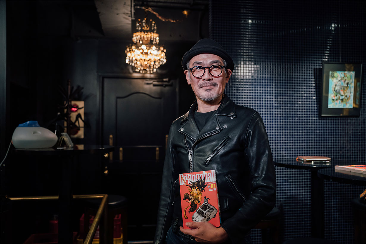
Interviewee: Hideaki Shimada
Book designer and CEO of Local Support Department Inc. Got his start in the magazine design industry in 1988, and later joined Banana Grove Studio in 1990. Designed covers for Weekly Shonen Jump for two years from 1997 before going independent in 2000 and working on the covers of various manga print releases, including the complete editions of SLAM DUNK and Dragon Ball. Later designed for the updated Jump Comics Dragon Ball releases, the full color version of Dragon Ball, the complete edition of Dr. Slump, and more. Opened his own design agency in 2010 called Local Support Department (L.S.D.).
Interviewer: Takahiro Kuroki
Editor and writer. Works at an editorial company while writing manga reviews and planning events on the side. Intends to do an independent print of Les Masques in 2022.
Twitter: @abbey_road9696
Kindling Interest from the Editor-in-Chief by Setting the Jump Pirate Ablaze
——I think there are tons of manga fans out there who have come across your work over the years without even realizing it. How was it that you came to be in the book-designing business to begin with?
Shimada: Well at first, my work had nothing at all to do with books. I was born in Maizuru, Kyoto, then moved to Tosu city in Saga Prefecture after graduating from high school to work at a distribution center for a food company. I spent my days driving forklifts and stacking cases of mayonnaise three rows high in a warehouse.
I'd always liked art, though, and I drew a lot during my time at the food company. I was transferred to the Tokyo branch when I was 20, but the salaryman life was tough, and plus, I wanted to get into the art industry, so I quit almost immediately and started looking for design work.
I managed to scrounge out a living for one or two years working parttime at a bar, and it was around that time that I found a wanted ad from a design company in a jobhunting magazine. I got an interview, and when they asked me, "Can you do layouts?" I just lied and said, "I sure can," and ended up landing the job without knowing what that even meant. (laughs)
That company handled design work for all kinds of books and magazines—encyclopedias, books on motorbikes, fashion magazines, anything—and so I just learned as I went along and tried my hand at everything that came my way. A driving force for me at the time was that I had no money, so I was desperately trying to improve enough to be at least on par with the other designers and be able to create things that looked professional.
——I can't believe that your whole design career started with a lie!
Shimada: Later on, that company went insolvent, and then I ended up getting a job at a different design business that went bankrupt soon after too... I had no idea what I was meant to do at that point, but by chance I found Banana Grove Studio and was able to get a job there. They worked mostly doing editorial design for manga and anime, as well as books and magazines about games, and it was from that time that I started working on material connected to Shueisha.
I ended up working there for a good 10 years, but my first job was doing layout design for the Romancing SaGa and Final Fantasy series strategy guides. Then, because I'd been working with games, I was put in charge of the V Jump designs, and I even worked on actual manga pages too.
——So how did you transition from that into doing cover designs for manga?
Shimada: That originated around my 5th year at Banana Grove Studio, when I started doing the cover designs for Weekly Shonen Jump.
There was a man named Kazuhiko Torishima, who was the first editor-in-chief of V Jump at Shueisha, and in 1996, he became the editor-in-chief of Weekly Shonen Jump. When that happened, they decided to create a new logo for the magazine and held a competition for it among a bunch of design companies.
——The same Mr. Torishima who Akira Toriyama fans have affectionately nicknamed "Mashirito".
Shimada: I submitted a rough* that I thought had no chance of being picked, but to my surprise, they accepted it. (laughs)
Until then, their logo had used both angular and rounded elements in its font, so I thought I'd try making it look more powerful and Gundam-like with really hard and sharp edges.
For the old Jump Pirate logo, I just thought it might look cool if I drew some flames around it or something. Mr. Torishima seemed to like it, and in the end, he even told me, "Thank you for setting the pirate on fire."
*"Rough" is a term used in the Japanese design industry for a rough draft sent to clients for confirmation before it goes to production.
——It's incredible that your design is still being used on the front cover after more than 20 years.
Shimada: Apparently, it's the magazine's longest-standing logo. I'm very thankful!
I also worked on the actual cover designs for Jump for two years, starting in 1997.
One of the covers I designed was for the issue that NARUTO (Masashi Kishimoto) was first published in. Since it's a story about ninjas, I remember including text for the traditional "Do-don!" drum sound and some little smoke clouds.
From the year 2000, I went independent as a freelance book designer, and thanks to my experience working with Jump, I ended up getting orders for manga covers. The first Shueisha IP I worked on was SLAM DUNK doing the covers for its complete editions (24 volumes, 2001–2002). I was surprised myself that they asked me to do it.
Fortunately for me, those went on to become bestsellers, and I was given the opportunity to design for other well-known series, including Dragon Ball's complete edition. Then in 2010, I started my own design company, Local Support Department (L.S.D.), and I've been doing cover designs for manga ever since.
The Red Covers, the World Cup, and Meetings with Akira Toriyama
——The first and second volumes of the Dragon Ball Complete Edition were released in December of 2002, and the rest were released at the pace of two volumes a month over the next year and a half or so, culminating in 34 volumes in total. When did you actually start working on the designs for the covers?
Shimada: I was first offered the Dragon Ball Complete Edition covers shortly after the SLAM DUNK Complete Edition's final volume was released in February of 2002. Then it was around July that year that I brought the roughs to Akira Toriyama to have a meeting with him and his production people.
That was actually my first time meeting him in person, and his wife was out at the time, so he offered to make me some tea himself, like, "Here, have a cup of tea!" and I was like, "Noo no no no!" I felt terribly rude having the great Toriyama make tea for me, but also very honored. (laughs)
——It sounds like you'd have been too flustered to even taste it. (laughs)
Shimada: When I went to show him my roughs, it turned out that he'd already drafted up covers for the first four volumes or so. Volume 1 was Goku with the Nyoibo, Volume 2 was Kamesennin jumping up and down, Volume 3 was Krillin doing a kick...which is almost exactly what the final versions ended up being.
He really likes vibrant greens, so that's what he had for the background color initially, but that was where I asked if I could interject with my own opinion, and I very timidly showed him the red-background roughs that I'd brought along.
——Why did you go with red for your designs?
Shimada: So, 2002 was the year that the FIFA World Cup was held in Japan and Korea. I was watching the Korean team play on TV, and when the camera panned across the spectators in the audience, it was this vast sea of bright red from all the jerseys they were wearing. That scene of overwhelming passion and enthusiasm had a real impression on me. I thought to myself that it'd also look really cool if instead of spectators in jerseys, it was a sea of red manga covers filling the shelves of a bookshop, so I started designing the roughs like that.
I asked Toriyama what he thought, and he said, "Hmm, that's not a bad idea!" and so red it was.
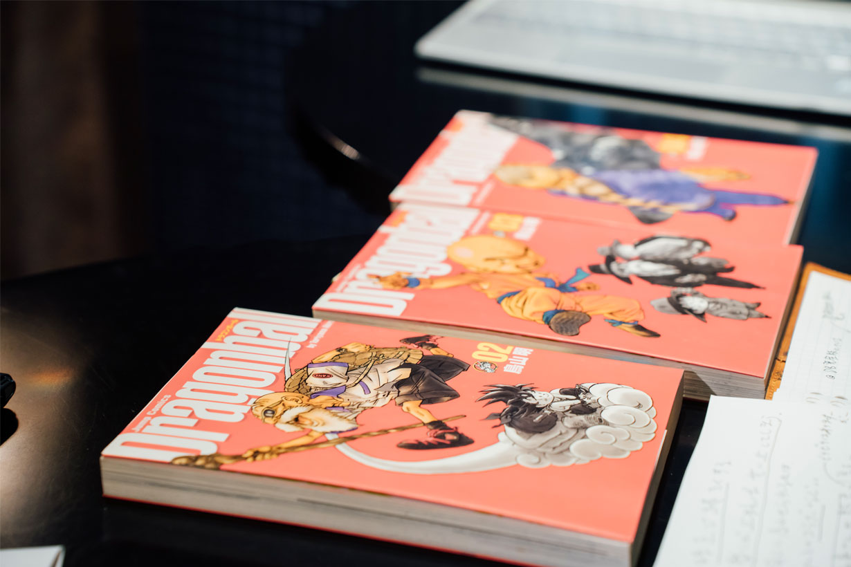
——The original Dragon Ball volumes were released with white and blue covers, so I was taken aback when I first saw your red covers on the complete editions.
Shimada: Since Toriyama had originally designed the covers with green backgrounds, he even went so far as to retouch the lighting effects on the characters to match the new red ones.
The original releases also had the title written out as "DRAGON BALL" in all capitals, but for the new covers, I made it "Dragonball" with lower case in a taller and thinner font because it looked neater. I came up with all these ideas to revamp the style, and Toriyama was kind enough to let me take the reins, so I had quite a lot of freedom in the design process.
We met two or three times to iron out the details, and then once the release schedule had been decided, it was a matter of taking the illustrations that Toriyama created for each version and figuring out how to crop them, where to position them on the cover, where to put the volume number, and all that stuff. UV curing was popular at the time too, so we even used that to add some shine to the character images.
——Along with main characters from the series, you also used monochrome renderings of side characters on the front and back covers. (Side characters appear in full color from Volume 19 onward)
Shimada: That was one of Toriyama's ideas. I asked for another character illustration during a meeting once, and he suggested that we also include other characters in monochrome.
I always looked forward to when he'd send me new illustrations for each volume so that I could see what he'd done with it that time. The art for Volume 20, for example, in the Frieza Arc, has Frieza standing up on a cliff, and for Volume 21 he included a slide of the background art behind Frieza too. He'd go from just characters to suddenly mixing it up with other elements. I got the impression that he put a lot of consideration into which characters and scenes to use on the covers as well as exactly how to present them.
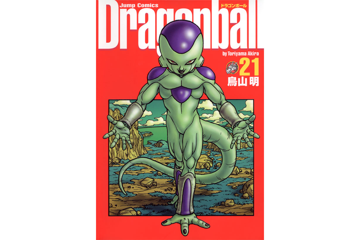
"Dragon Ball" Complete Edition Volume 21
——Did you ever ask him to make any changes to his illustrations?
Shimada: Not even once.
That goes for all of my manga cover design work. If the illustrations look good, they'll be perfect in any layout. There's no need for any input from me in that regard—the art makes the cover.
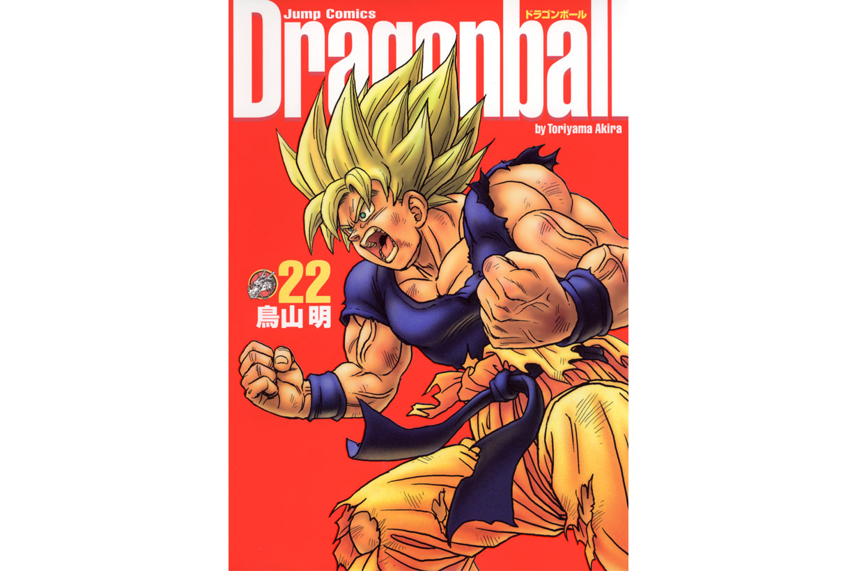
▲Hideaki's favorite Dragon Ball Complete Edition cover is the one for Volume 22,
which features Goku's long-awaited Super Saiyan transformation from the Frieza Arc.
"I just love that illustration. It's the muscles. Have you ever seen someone so ripped?"—Hideaki Shimada
——As a reader, I really like the spines too. The way they form one long picture when you line them up is just like the original Jump Comics versions.
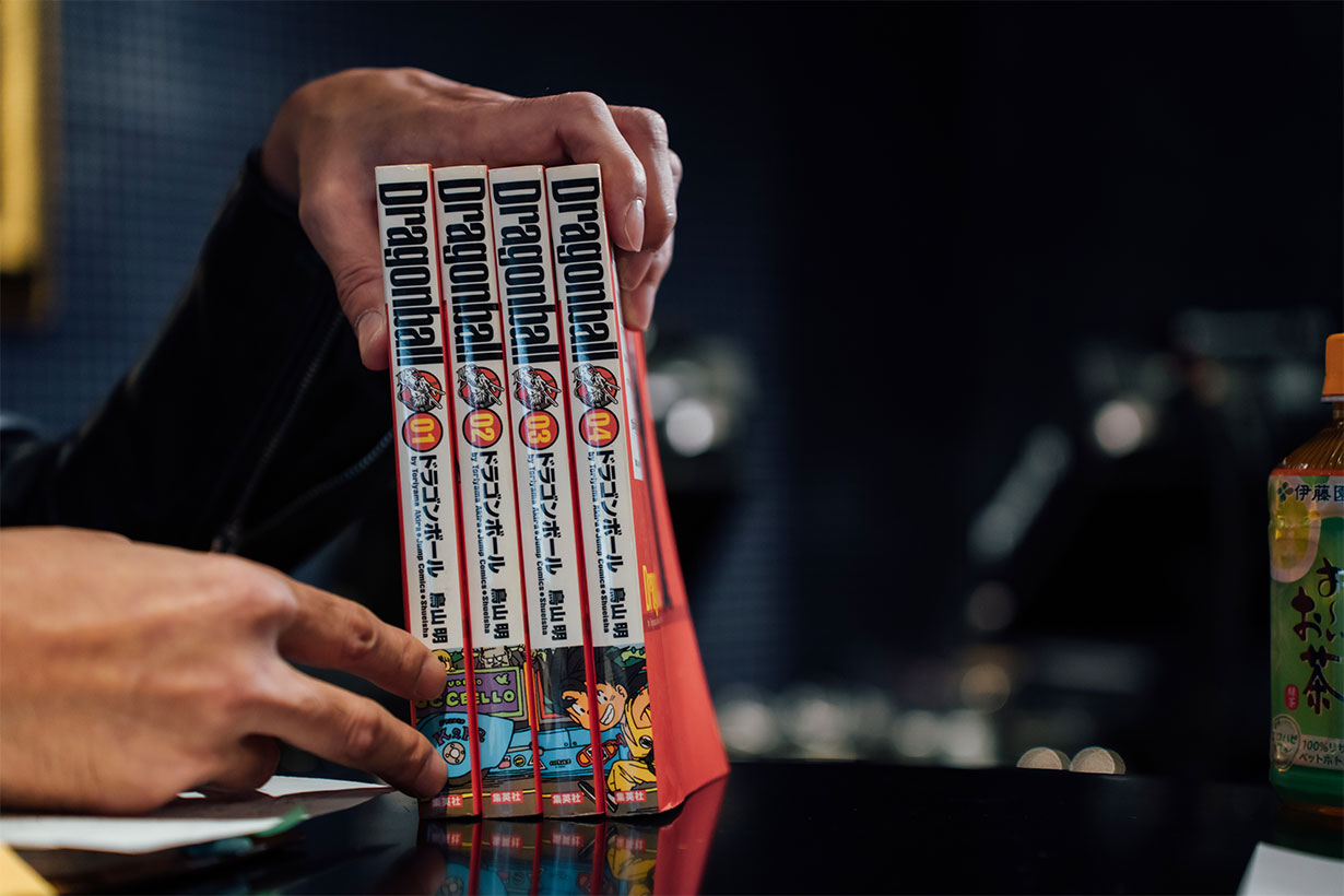
Shimada: That was actually an idea the editor had at one of our meetings. It's certainly something that fans who collected comic books as kids enjoy.
As opposed to when a series is still ongoing and you don't know how many volumes there'll end up being, the Dragon Ball Complete Edition was fixed at 34, so what I was able to do was measure how long the books would be when you line them all up and then ask Toriyama, "I need a picture about this long, please," and leave the rest to him. I had no idea that it was going to end up as a car race between the characters. (laughs)
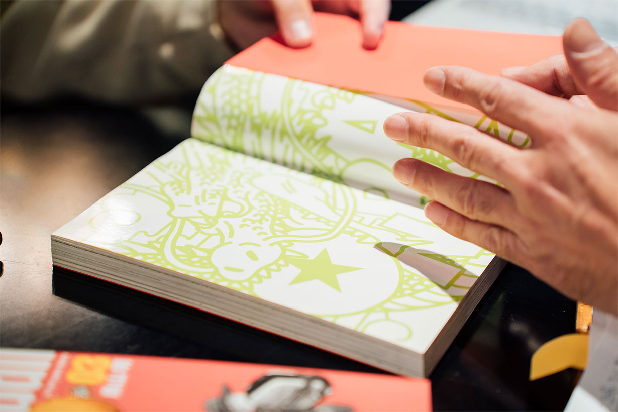
——One thing that all the front and back inner covers have in common is that they have pictures of Shenron on them. I like the symbolism there that no matter how strong Goku and his friends grow throughout the series, Shenron and the Dragon Balls themselves will always play a crucial role in the story.
Shimada: That one was my idea. Volumes 1 to 7 of the original Jump Comics version had Shenron drawn across their spines, and I thought it'd be good to include that on the inside covers, so I asked Toriyama for an illustration to use.
Since we went my way on the covers and made them red, I wanted to include the green that Toriyama likes so much for this part. I also wanted it to look a little bit cute, so I asked him to use thick lines as though it was drawn with a magic marker or something, and this is what he came up with.
Teamwork in Design and Dragon Ball
——What do you like about Dragon Ball from the perspective of a book designer?
Shimada: I think it'd have to be the quality of the illustrations. Every time you turn over a new page, it's almost like you're reading a pop-up book with how the art jumps out at you.
The linework is also very tight. Each individual panel is polished to a degree that it can stand on its own as a work of art. It still amazes me that Toriyama was able to create such complete artworks at the pace of a weekly serialization with almost no assistants for the most part.
――How about the story?
Shimada: I really enjoy the comradery between Goku and his friends.
Whenever a big strong villain comes along, the heroes train together, grow stronger together, just manage to combine their powers together in the final battle, then win together in the end. In the design world, you can't just have one person at the top shouting down all the orders either—you need teamwork in order to be successful. So that's something I can relate to from Dragon Ball.
Gohan's time training with Piccolo left an especially strong impression on me too. The idea of an initially weak student aspiring to one day be like their powerful mentor and gradually improving is a common thread in the design industry. It reminds me of when I was coming up and restlessly watching the more experienced designers around me, doing everything I could to get better.
——So while your career began with a lie that you knew how to do layout design, you kept training and training until now, where you're among the best in the entire industry. What part of your work gives you the greatest sense of fulfilment?
Shimada: When a product that I designed for is selling well. Nothing feels better than that.
It's all about figuring out what will draw in people's attention and make them want to buy that book or magazine when they see it lined up on the shelves at the bookstore. Do you use a striking color as we did for the Dragon Ball Complete Edition books? Do you focus on the layout of the title logo? There are a lot of different angles you can approach it from, but when it sells, that's when you know you've done a good job.
If I get a job where the client is saying, "Just go crazy!" sometimes I'll take them up on that and get really creative. No matter what I'm working on, though, the thing I keep in mind is that I want to create something that will put a smile on the faces of the author, the editor, and the readers.
Honestly, I think you probably get the best outcome when the manga artist themselves is able to draw the covers the way they want. That definitely sells better than designers suggesting this or that.
But it isn't always feasible for the artists to do the covers themselves, and that's where we come in. We consult with them, figure out what they want, and create the right design together.
In the end, what really matters is the story itself—the work of us designers is simply to help people notice it.
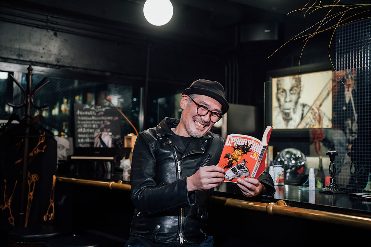
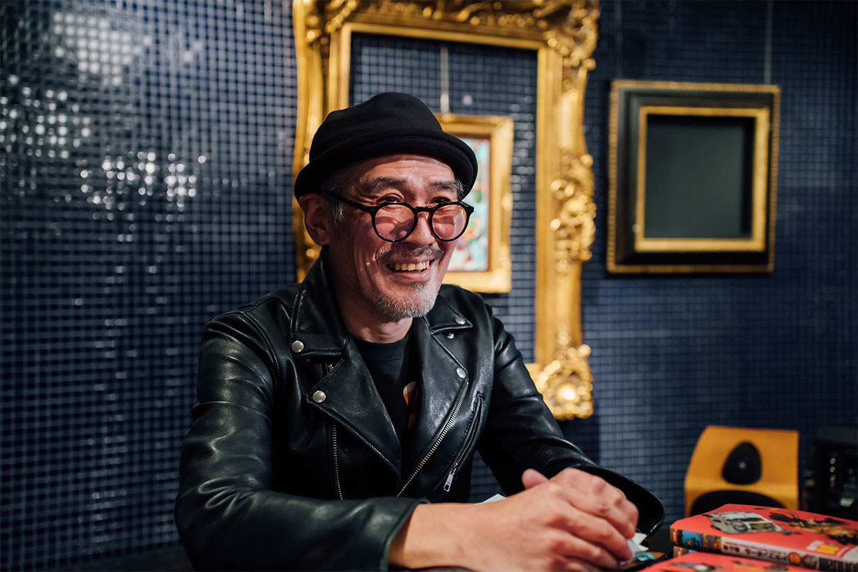
Photography: Makoto Tsuruta
Location: Bar LSD (2F Aono Building, 30-10 Sakuragaoka, Shibuya, Tokyo)
This site includes machine-translated texts. Please be aware that you might find some unusual expressions that are difficult to understand.